A pillar page is a comprehensive piece of content that covers a broad topic and links out to cluster pages (subpages) that dive deeper into specific aspects of the main topic.
This article will show you five concrete examples of great pillar pages. But first, let’s go over what a good pillar page looks like.
What Makes an Effective Pillar Page?
An effective pillar page covers a broad topic in depth without overwhelming the reader with information. It should serve as a topical hub, linking out to other pages that provide more information about specific aspects of the main topic.
Effective pillar pages also typically:
- Have clear structures with intuitive navigation
- Use headers to signal different subtopics and answer key questions
- Link out to both internal and external resources where relevant
- Contain helpful visuals (if appropriate) to make the topic easier to understand
If you want to learn more about the fundamentals, check out our dedicated guide to creating pillar pages.
Below, we’ll highlight what each example does well and what sets it apart from other pages in their niche.
We’ll also use Semrush data to illustrate the performance of each pillar page. Try the Semrush SEO Toolkit to explore the performance of these pages (and your own pillar pages) for yourself.
5 Effective Pillar Page Examples
1. Brand Awareness Pillar Page by Qualtrics
URL: https://www.qualtrics.com/experience-management/brand/what-is-brand-awareness/
Industry: Marketing
Monthly organic traffic: 1K
Number of backlinks: 175
Ranking keywords: 636

This pillar page example from Qualtrics tackles brand awareness in an easy-to-follow way. It’s part of a broader brand experience management cluster of topics on the Qualtrics website.
Why It’s a Great Pillar Page
Qualtrics’s brand awareness pillar page is easy to navigate thanks to the sticky progress bar on the left.
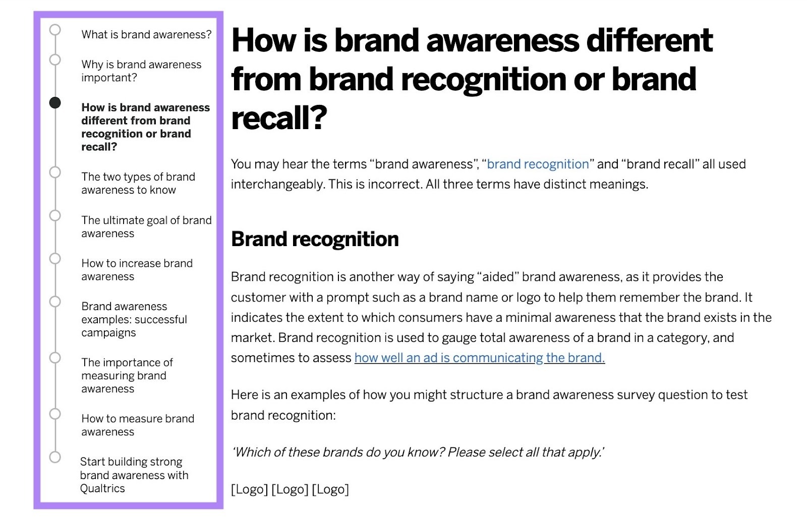
The progress bar follows the reader down the page. And unlike a simple table of contents, it has an expanded layout that makes it clear how far through the page you are. This is helpful since it’s a 31-minute read (per the read time widget at the top).
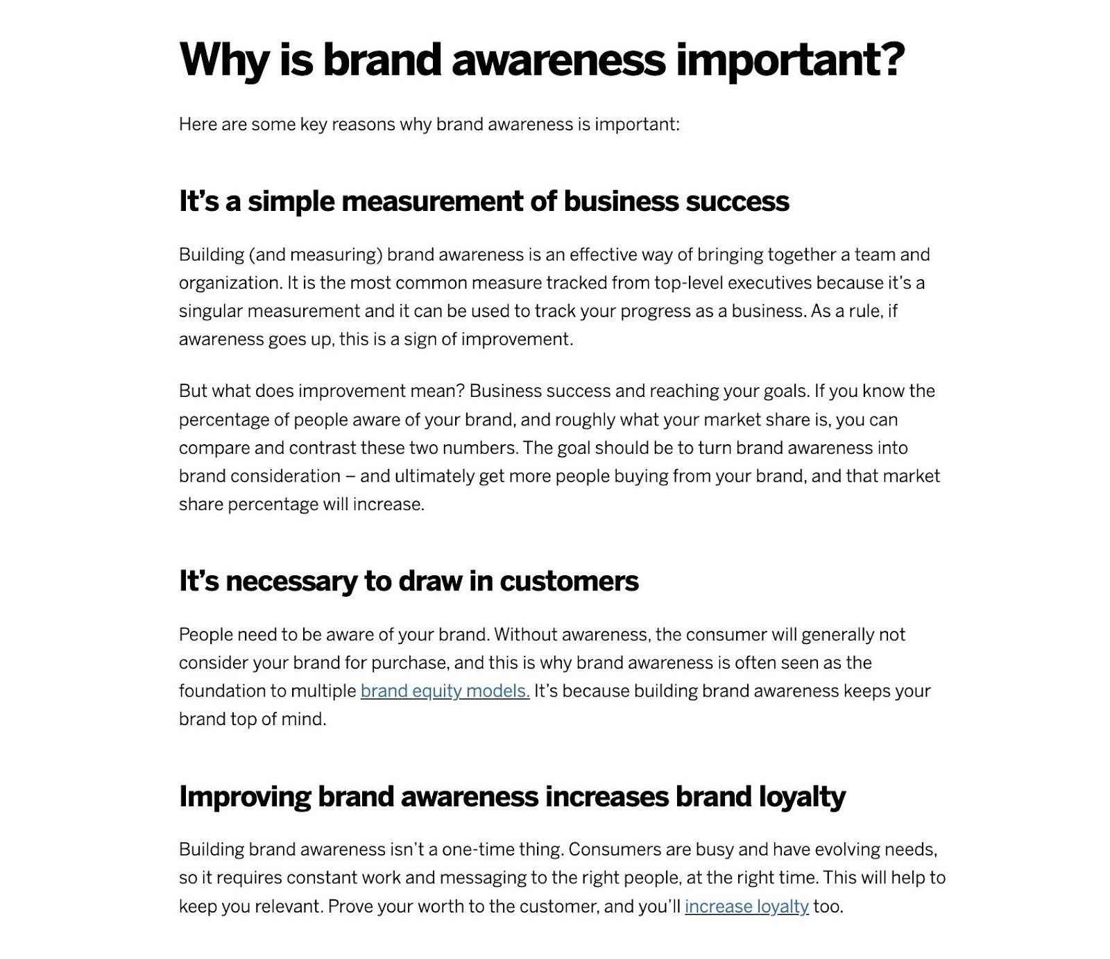
Beyond that, the layout of the page itself makes it easy to follow along. For example, there are clear questions as headings, followed by straightforward but detailed answers.
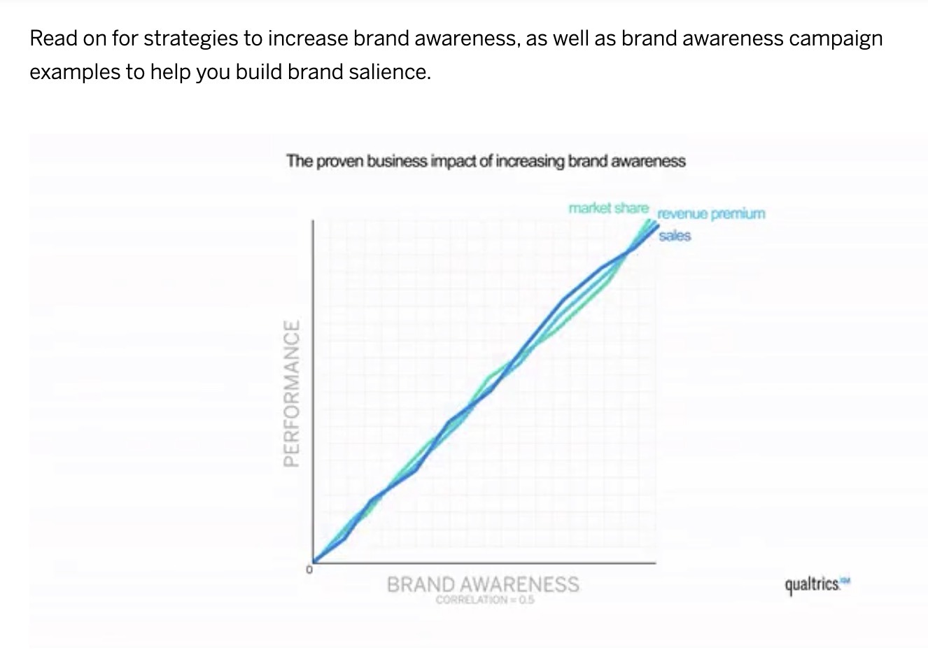
To break up the text, the guide makes use of images and even animations to break up the text and illustrate key concepts.
Then, right at the end, there’s a call to action (CTA) to download an ebook about how to optimize the customer experience. Along with helpful resources if you want to learn more about related concepts.

2. Allergies Overview by Healthline
URL: https://www.healthline.com/health/allergies
Industry: Health & Medical
Monthly organic traffic: 163
Number of backlinks: 1.5K
Ranking keywords: 1.3K

Healthline's comprehensive allergy guide showcases how businesses that cover “Your Money or Your Life” (YMYL) topics can create authoritative pillar pages that are likely to be seen as authoritative by search engines and AI platforms.
This pillar page serves as the central hub for the site’s extensive allergy content cluster.
Interestingly, Healthline’s page consists only of text—no images. While this approach won’t work for everyone, it can work well for topics where users are likely looking for quick information.
Why It’s a Great Pillar Page
Right at the top of Healthline’s allergy pillar page, there’s a handy list of links to each section in the article. Below that is a key takeaways box that gives a broad summary of the post, which reduces the time to value for the reader.

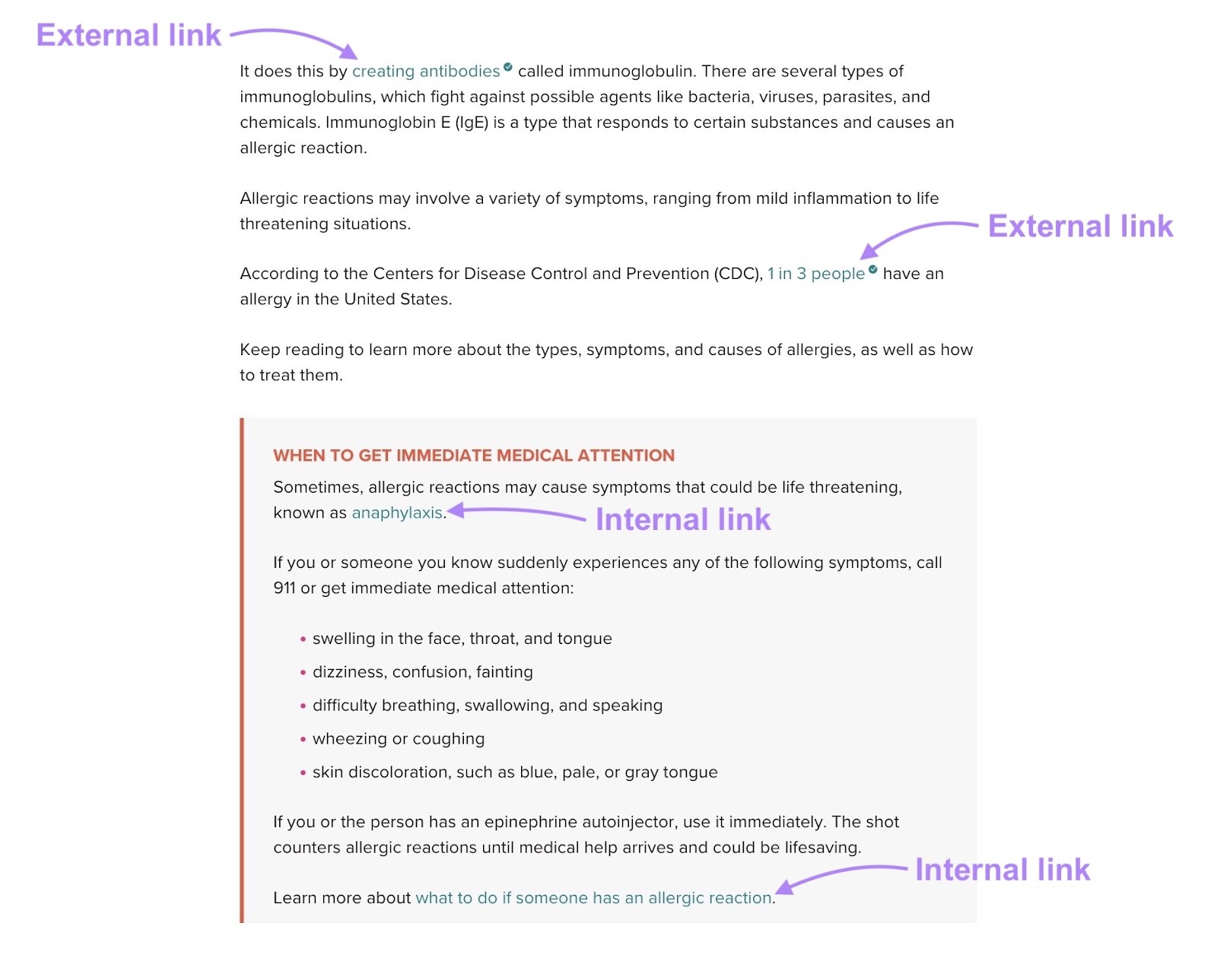
In the body content, Healthline uses a good mix of both:
- External links from authoritative sources to back up their claims
- Internal links to their own resources for readers who want to learn more
Because the topic is so wide (there are lots of different types of allergies), the page covers much of it broadly, without dense informational sections. It uses bulleted lists to lay out the types of allergies and common symptoms.
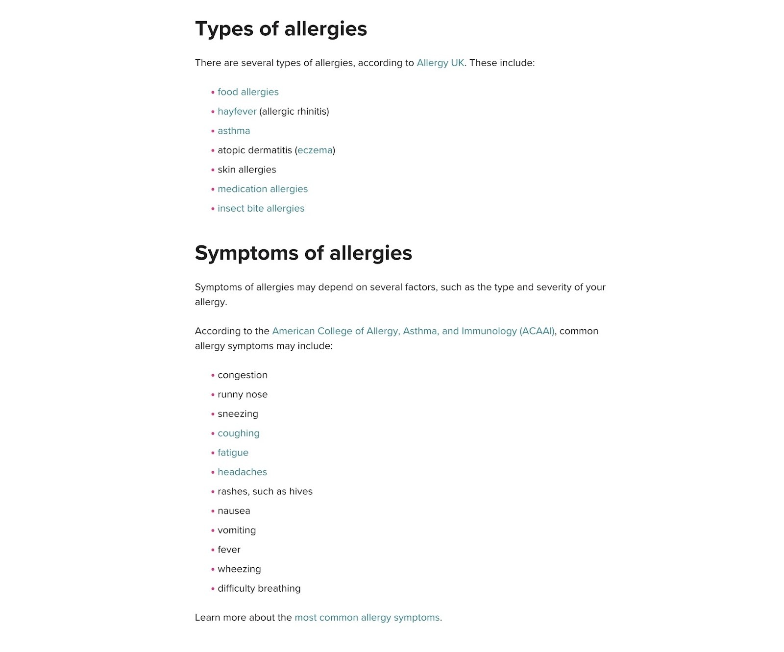
At the end of the page, there’s a section titled “How we reviewed this article.” This is useful because accuracy and freshness are important both for users seeking and for search engines and AI tools that aim to surface relevant content.

There’s also an FAQ section that answers three common questions.
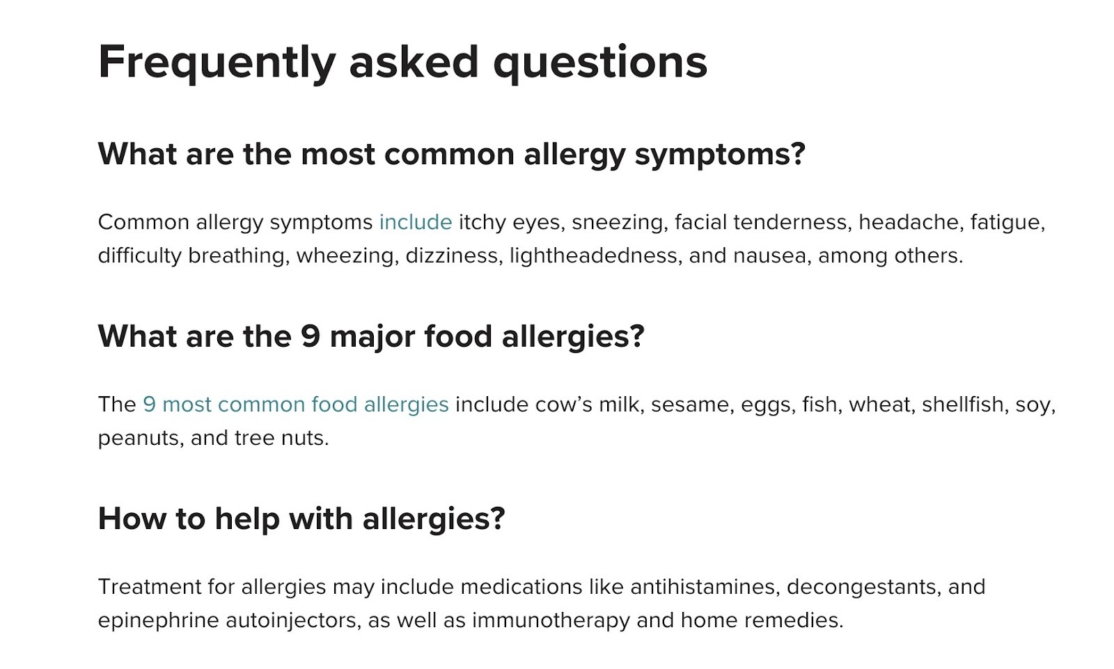
We might expect to see a few more FAQs to make this section truly useful. Plus, including question-based keywords with helpful answers can also be useful for gaining visibility in large language models (LLMs). For example, answering questions like:
- When is allergy season? (6.6K monthly searches)
- Are allergies genetic? (4.4K monthly searches)
- What causes allergies? (3.6K monthly searches)
Find FAQs for your own pillar pages with the Keyword Magic Tool, part of the Semrush SEO Toolkit. Just type in a seed keyword and use the “Questions” filter to highlight related keywords to target.

3. Beginner’s Guide to Cloud Computing by Microsoft
URL: https://azure.microsoft.com/en-us/resources/cloud-computing-dictionary/what-is-cloud-computing
Industry: Information Technology
Monthly organic traffic: 59.1K
Number of backlinks: 1.2K
Ranking keywords: 6.2K

This cloud computing hub from Microsoft illustrates how pillar pages don’t need to be huge or information-dense to work well.
This pillar page is just over 1K words long, and it doesn’t feature images aside from those in the hero space and CTA. Instead, the focus is on providing digestible information about a complex topic.
Why It’s a Great Pillar Page
Microsoft opted for concise but comprehensive sections throughout this pillar page. With simple but helpful breakdowns defining what cloud computing is, what the different types are, and the main benefits of the technology.

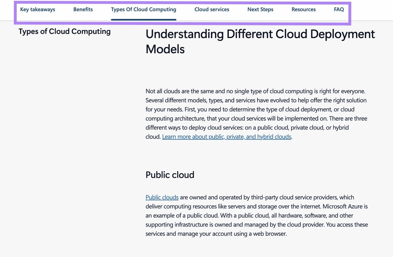
Instead of using a traditional table of contents, there is a horizontal list of sections at the top. This makes for easy navigation as you read the page.
The concise approach continues further down. But there are also lots of internal links to other cloud computing articles on Microsoft’s site.
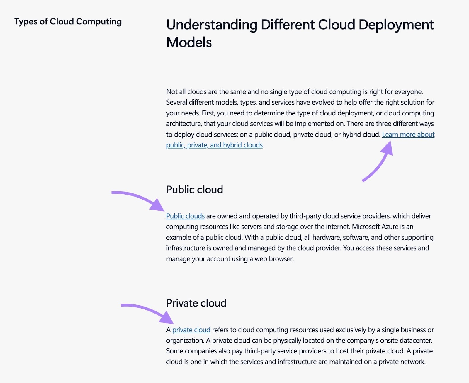
For technical topics like this, it could easily get overwhelming with large sections of text for each type. The internal links let users decide what they want to learn more about.
There are more links to related resources at the bottom of the page. Along with a CTA for Microsoft’s cloud computing services.
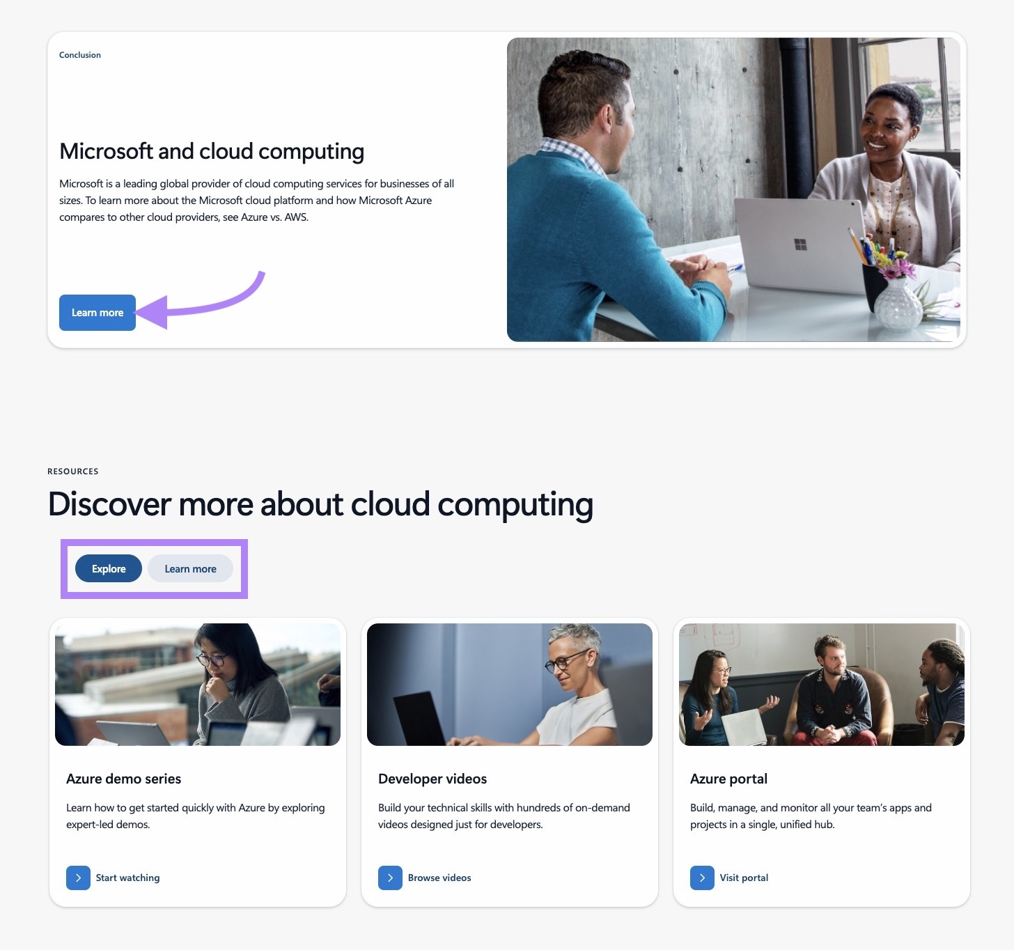
Overall, it’s a simple but effective pillar page worth emulating if your site also covers technical topics.
4. Restaurant Costs Guide by 7Shifts
URL: https://www.7shifts.com/blog/restaurant-costs/
Industry: Business
Monthly organic traffic: 1.4K
Number of backlinks: 222
Ranking keywords: 666
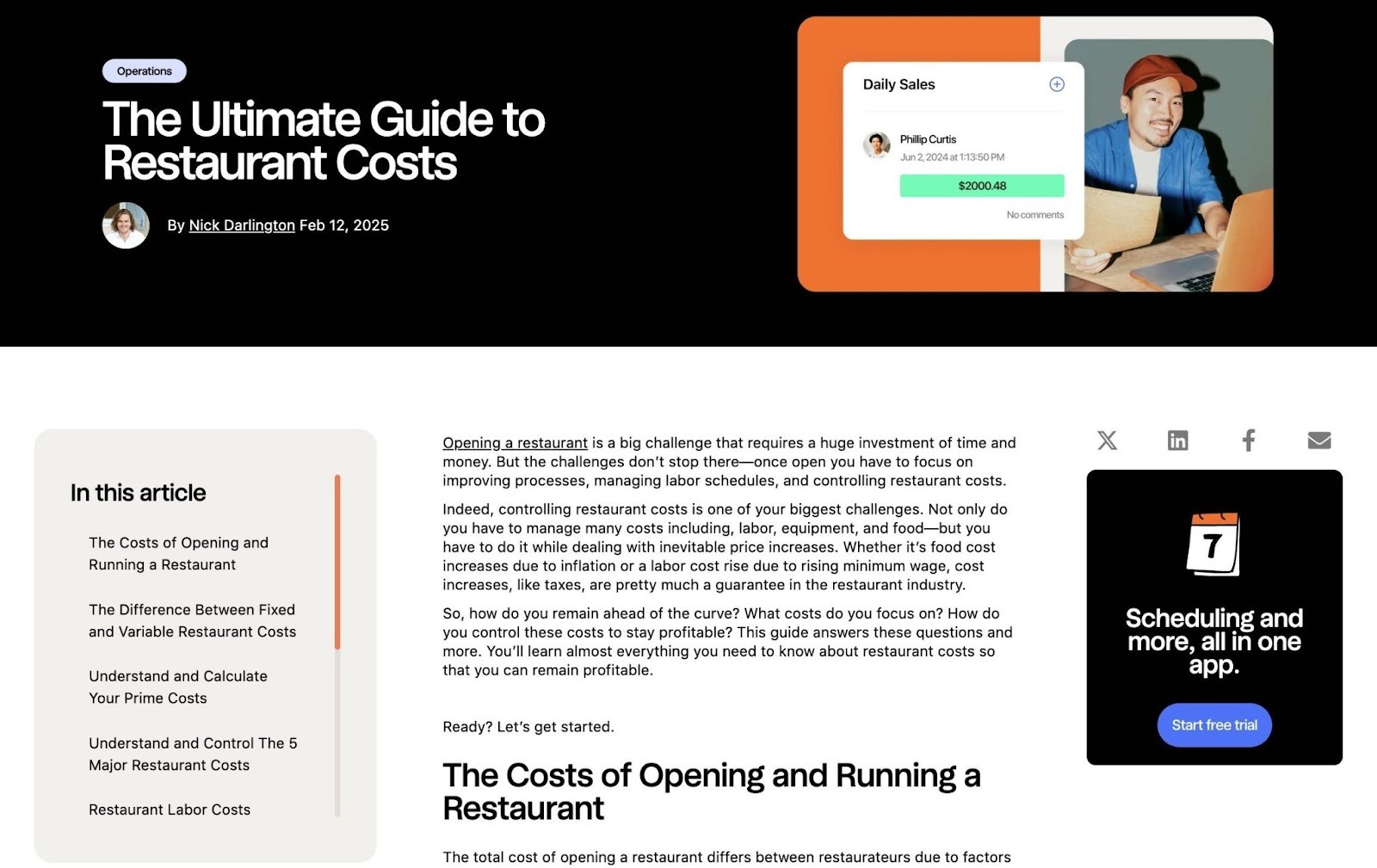
7Shifts' restaurant costs guide covers everything restaurant operators need to know about everything from labor and food expenses to equipment and overhead. And links to 7Shifts' other articles about restaurant bookkeeping, accounting, and labor costs.
Why It’s a Great Pillar Page
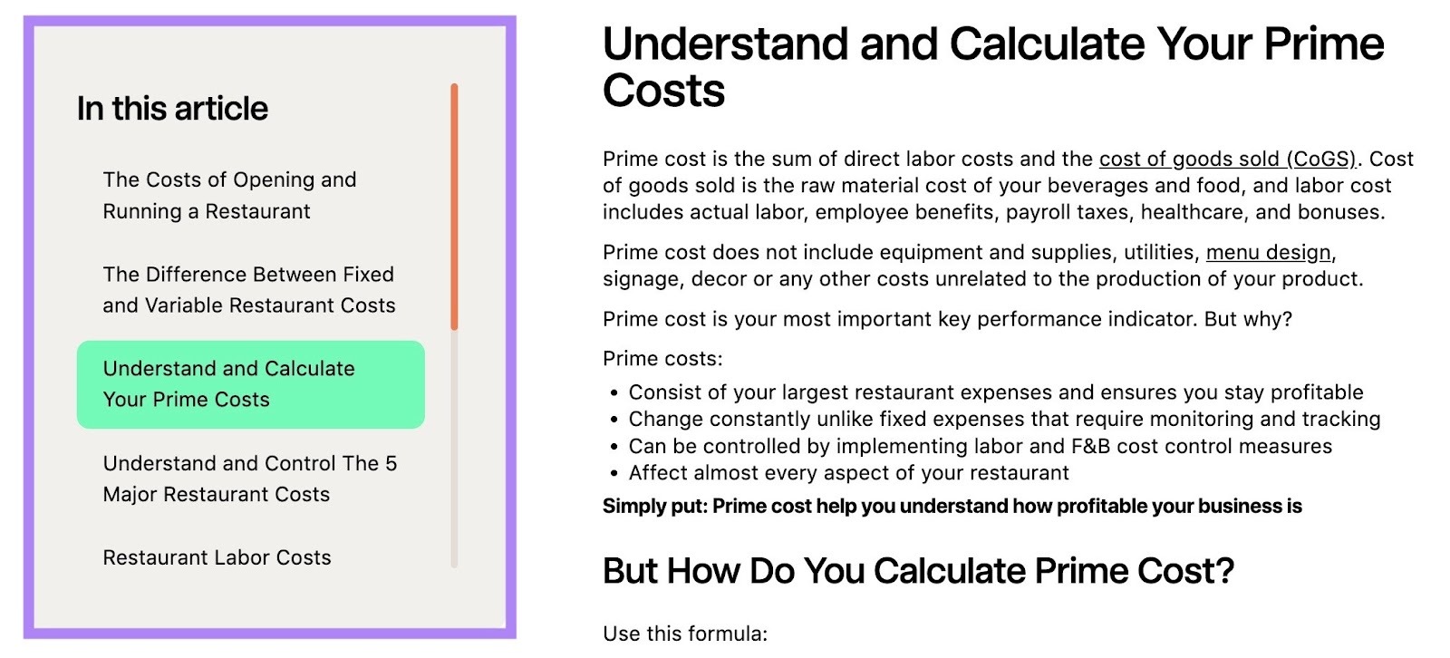
Like any good pillar page, this guide from 7Shifts is easy to navigate thanks to the sticky table of contents.
(We do wish it auto scrolled though. This usually makes for a more intuitive experience.)
The guide is heavy on the information—in a good way. The focus is on giving users a full breakdown of what costs to expect when running a restaurant.
There are also step-by-step calculations with formulas to determine specific expenses.

And there are helpful graphics throughout. These help visualize an important and potentially daunting topic for new (or hopeful) restaurant owners.

The page also contains helpful internal links throughout, pointing readers to more in-depth resources on specific aspects of restaurant costs.
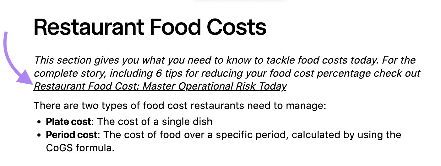
The links would stand out more if they were a different color than the rest of the text. This is something to consider for your own internal links.
The restaurant cost guide also has CTA links for 7Shifts’ product throughout. And there are CTA boxes on either side of the content—one for a newsletter and one for the brand’s app.

The 7Shifts team has probably optimized their CTA placement for conversions. But to find your own optimal CTA placement, you’ll likely need to run A/B tests to see what your specific audience prefers.
And be aware that including too many CTAs on your pillar pages might distract or frustrate readers.
5. Email Marketing for Beginners by Mailtrap
URL: https://mailtrap.io/blog/email-marketing/
Industry: Marketing
Monthly organic traffic: 509
Number of backlinks: 557
Ranking keywords: 911

Mailtrap’s pillar page about email marketing makes good use of multimedia to engage users and provide a helpful experience.
Email marketing is a huge topic. So, it’s no surprise this is the longest pillar page on this list (by word count).
Why It’s a Great Pillar Page
The informational sections on this pillar page are helpful on their own. But the embedded videos from the brand’s YouTube channel add even more useful context for readers.

The sticky table of contents is comprehensive, and it goes beyond just the main H2s. This lets users see everything the pillar page will cover at a glance.
However, the screenshot below shows we found the table of contents to be a little glitchy at times. It didn’t always take us to the right section when we clicked it. Or follow us accurately down the page.
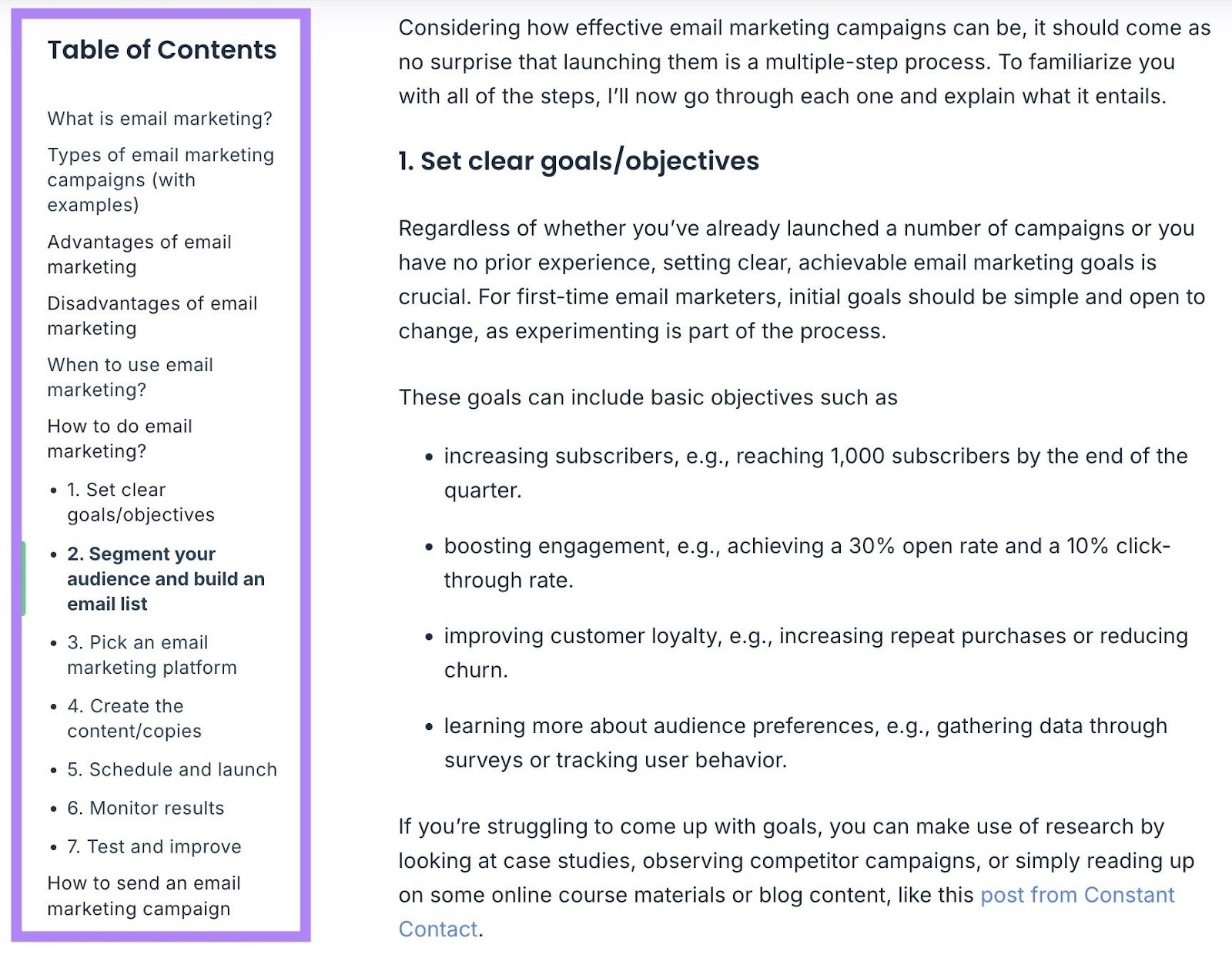
This is why it’s a good idea to check the functional elements of your pillar page from time to time. Just to make sure everything is working properly and that you provide a great user experience.
Mailtrap’s pillar page includes lots of helpful visual breaks, including:
- Screenshots
- Video embeds
- Tables and other structured data

Mailtrap makes good use of a table to provide a summary of important metrics and benchmarks for each one. This helps beginner readers understand what kind of numbers they should be aiming for.
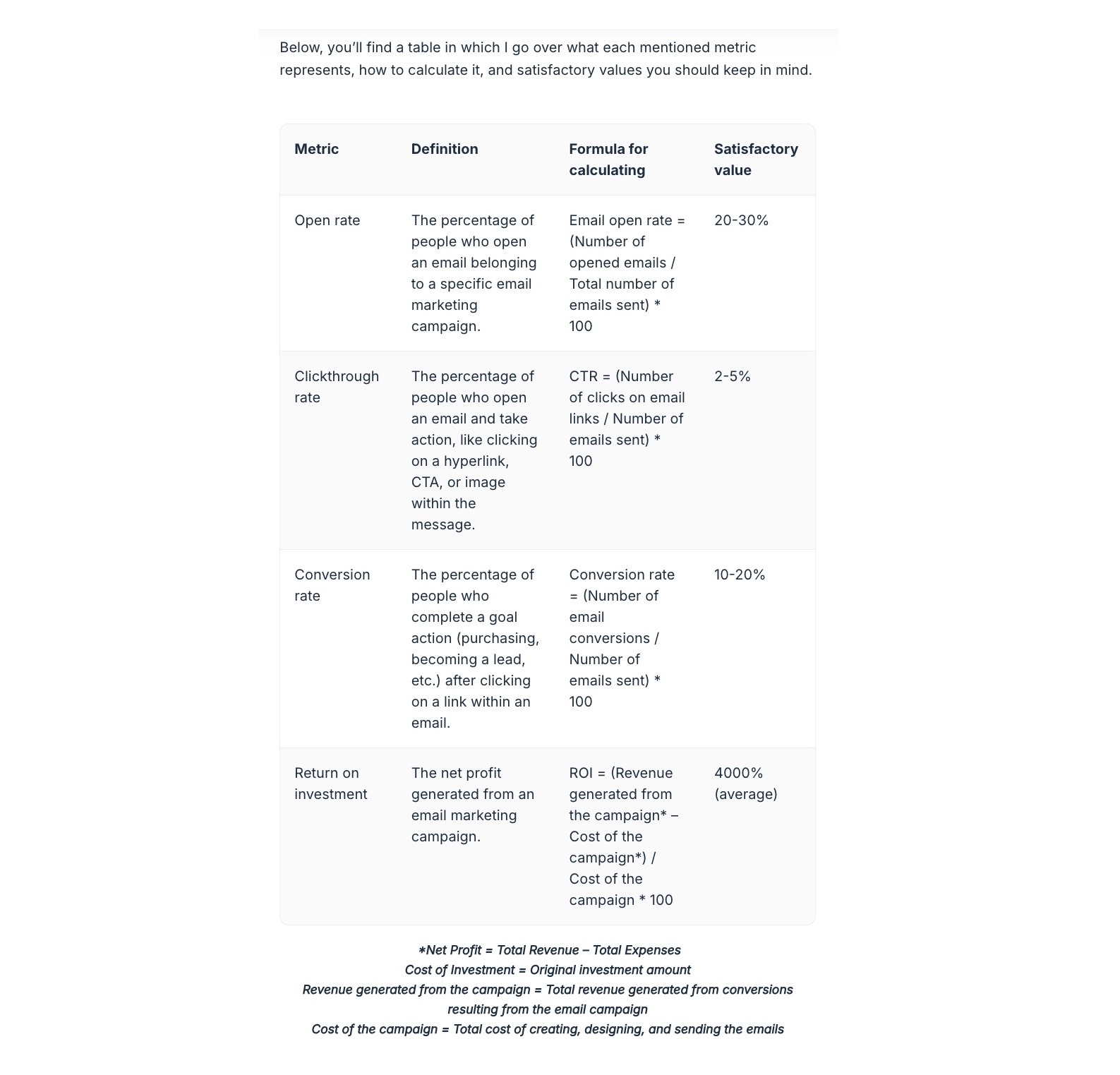
For the text sections themselves, the focus is on concise, value-dense snippets. These let the pillar page cover a lot of ground without overwhelming the reader.
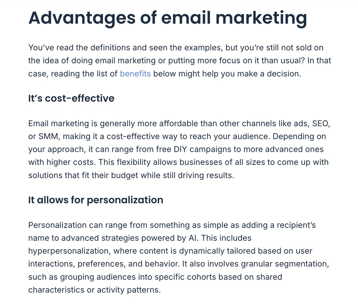
Throughout this content, there are lots of internal links to pages covering critical aspects of an email marketing campaign readers will likely want to learn more about. Like email sender requirements and how to avoid being marked as spam.

Aside from information and guidance, there are actionable steps to set up your own email marketing campaign. This makes the pillar page more than just a resource hub.
The page finishes up with a list of related guides on Mailtrap’s website. Which is useful for readers who want more information.

Build Your Own Pillar and Cluster Pages
The first step to build your own pillar page (and supporting cluster pages) is to identify a broad topic to cover.
To do this at scale, use the Keyword Strategy Builder. Just enter a keyword (or up to five) and click “Create.”
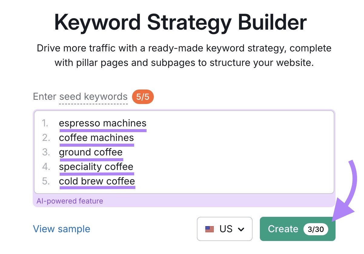
The tool will generate pillar page topics. And cluster topics for each one.
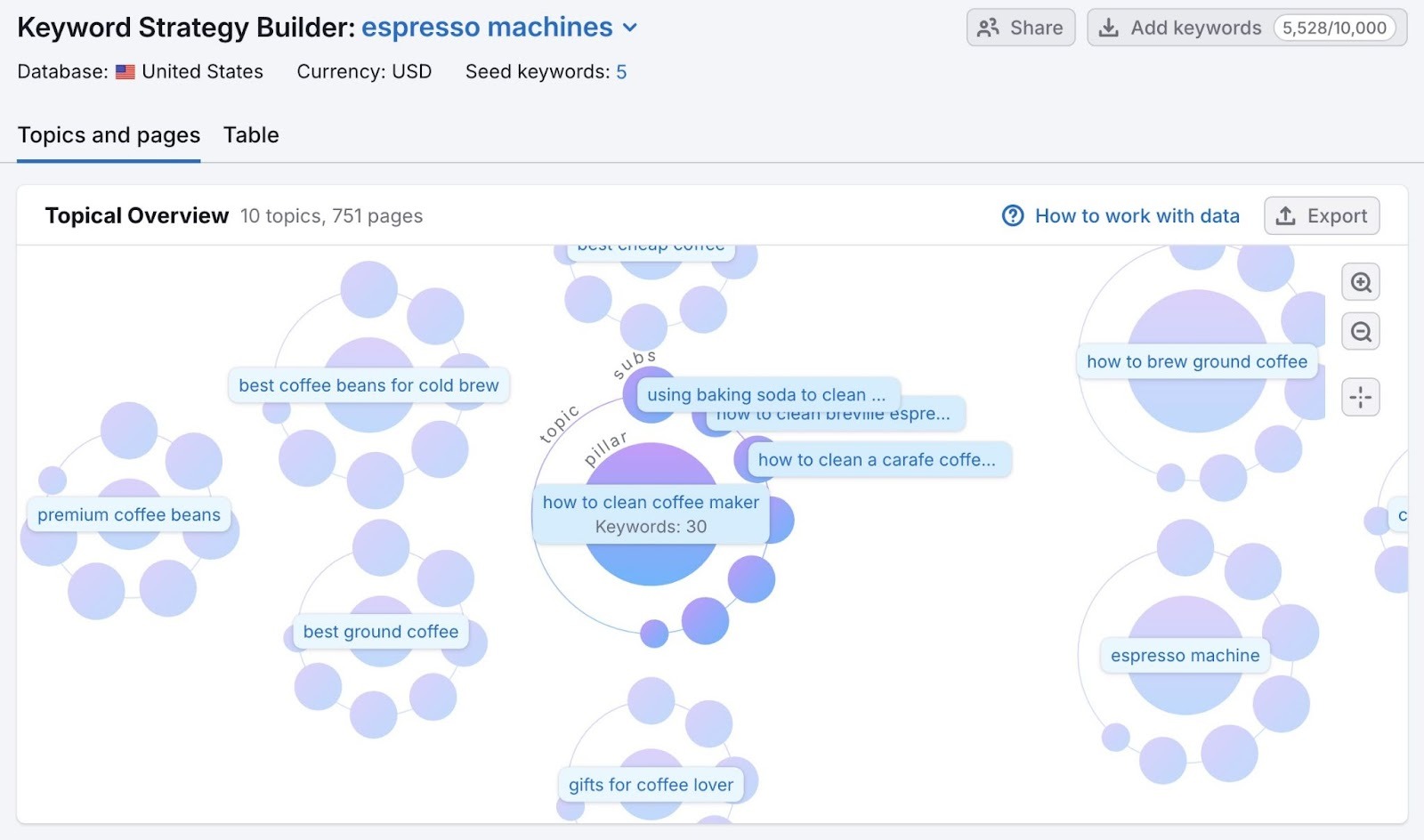
Scroll down and you’ll see pillar page suggestions and related subpages you might want to create.

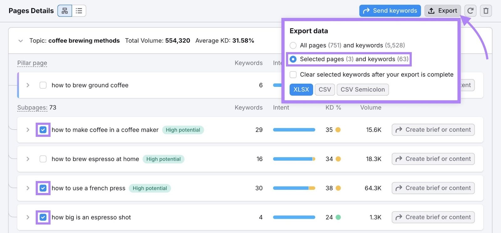
Select the keywords you want to target, click “Export,” and choose “Selected pages and keywords” to export the keywords. Then use this list to inform your pillar page strategy.
Start building pillar pages today with the Semrush SEO Toolkit.